Glint website
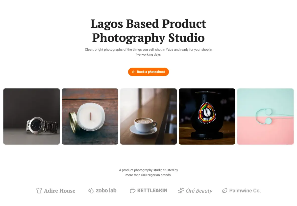
A bright studio site built around rows of product photos, with a serif headline and soft coloured cards.
55 templates for websites, landing pages, webinars, menus and your link in bio. Real previews of each one, and every template opens in the startbuddi editor, ready to make your own. No code.
Filter by what you are making or by your kind of business. 55 shown
A bright studio site built around rows of product photos, with a serif headline and soft coloured cards.
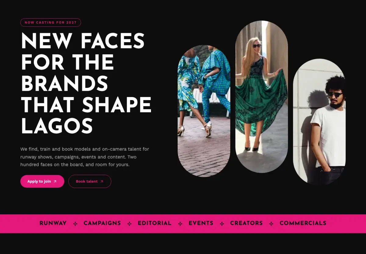
A dark, fashion-forward site for a model or talent agency, with pill portraits and a board of faces.
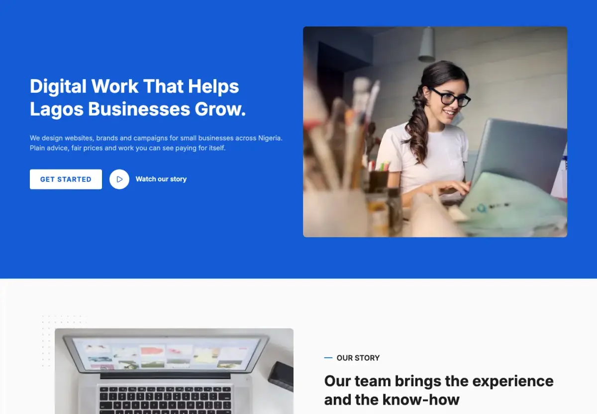
A clean, blue business site for agencies and consultants, with bold titles, tidy cards and clear prices.
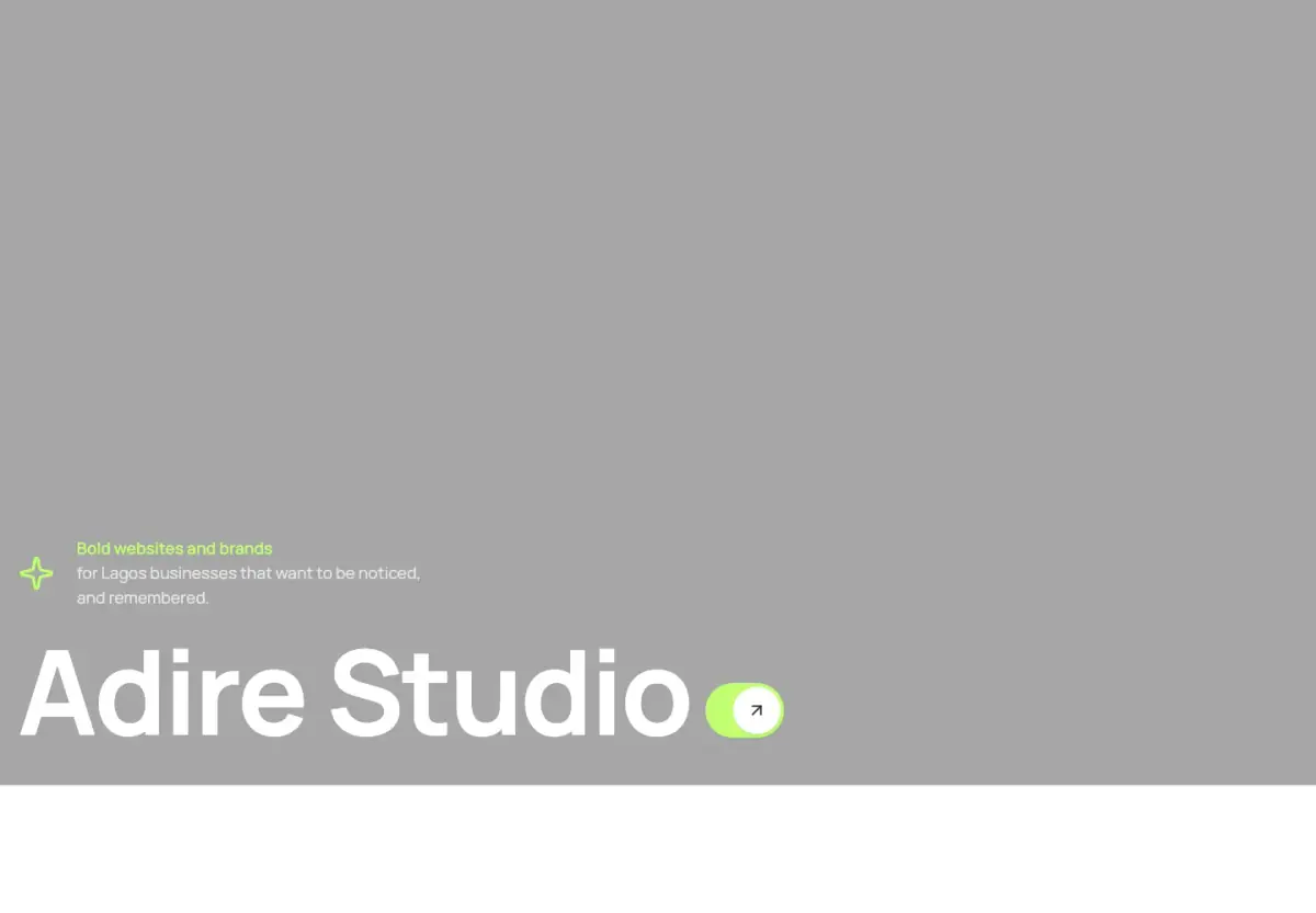
A bold creative studio site with a dark photo hero, lime accents and numbered sections.
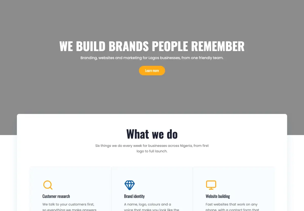
A friendly agency site with a photo hero, a white card of services, cobalt bands and a wave footer.
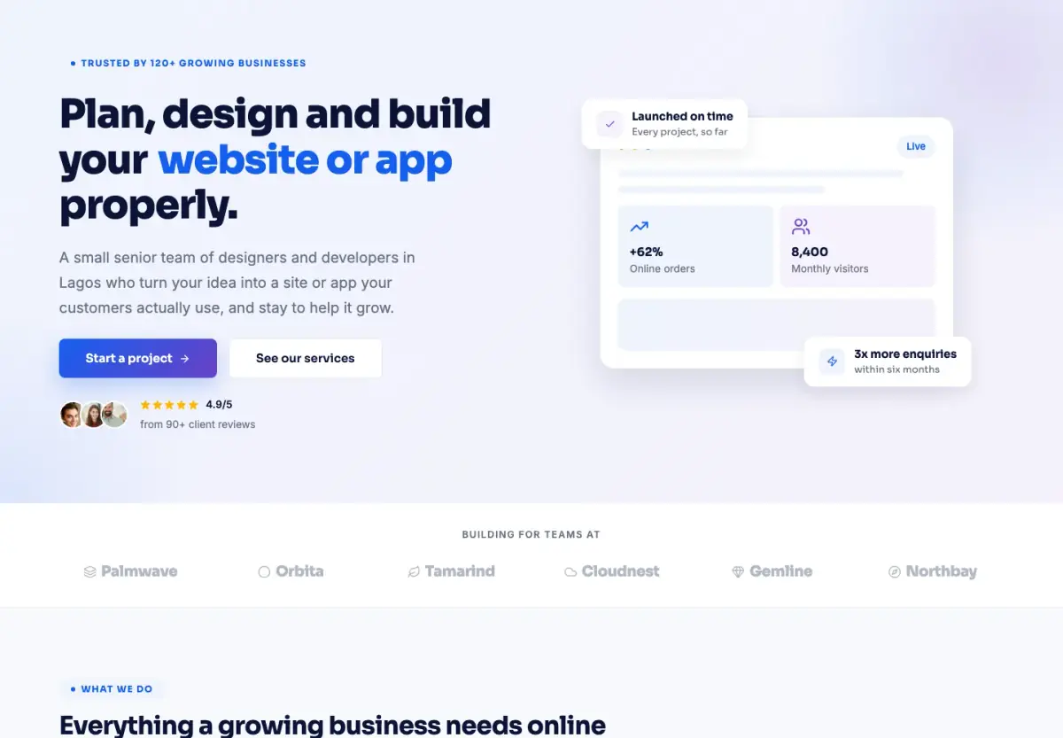
A tidy studio site with a lavender hero, a dashboard card, soft shadows and its own pricing page.
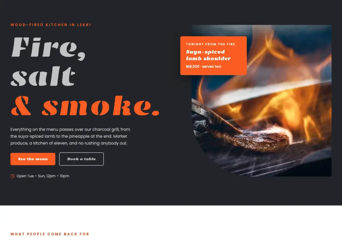
A bold, dark restaurant site with big type, a menu with prices and a private dining room.
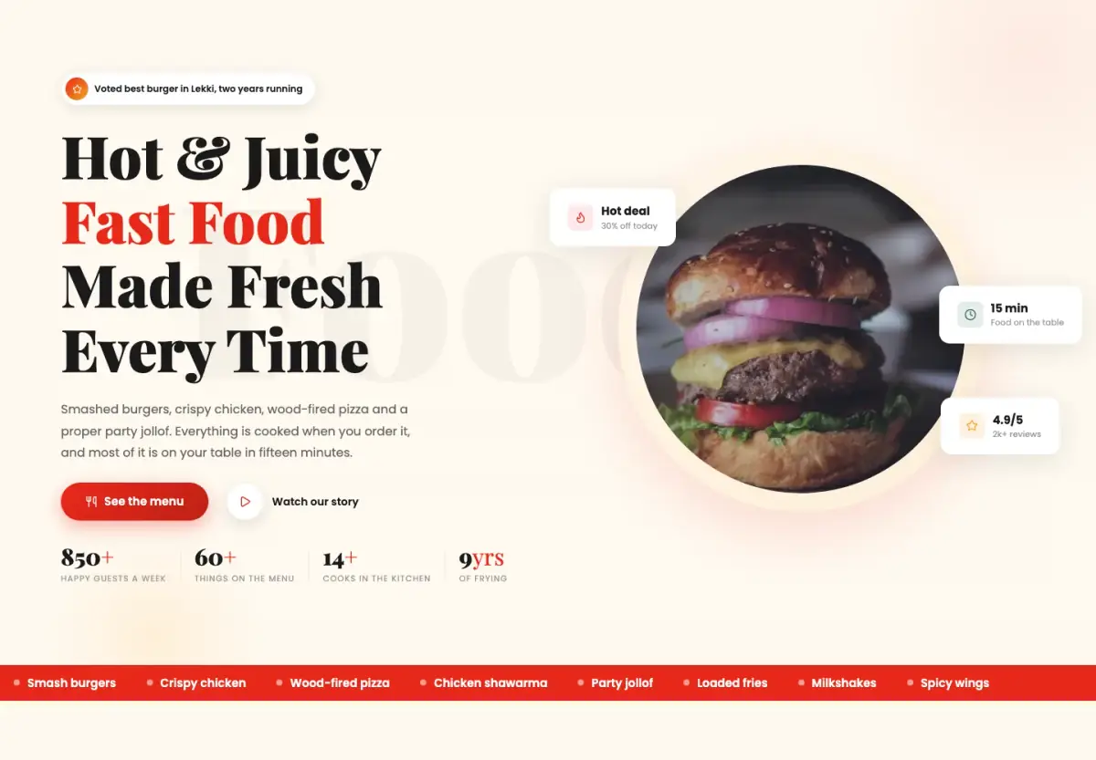
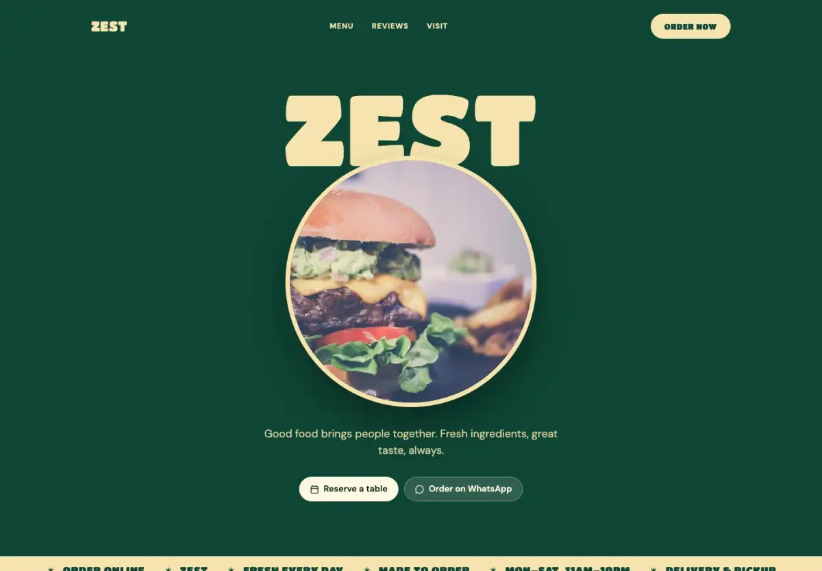
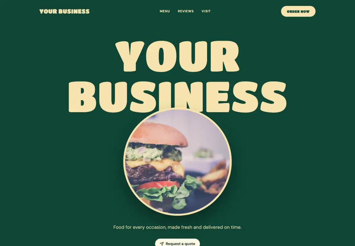
A bright fast-food site with a burger in a glowing circle, menu cards with prices and red pill buttons.
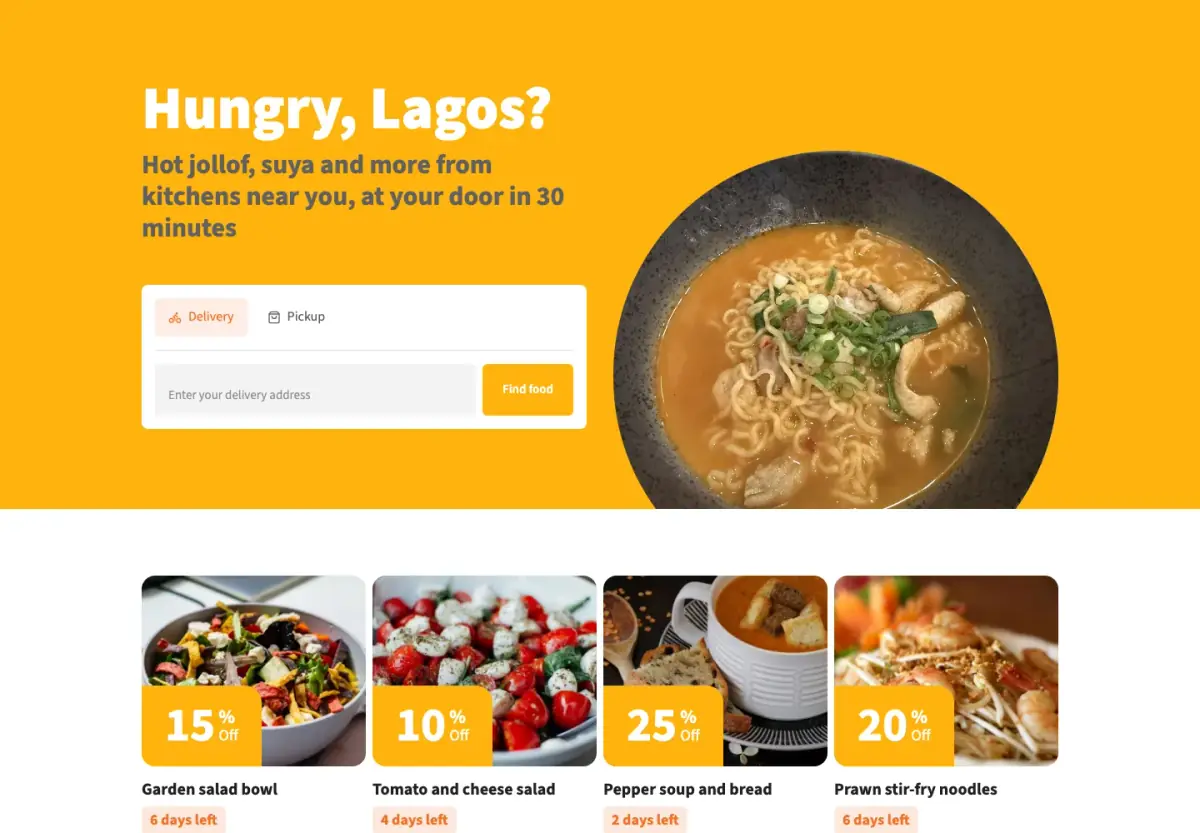
A bright yellow food ordering site with an order box up front, offer cards, dishes and kitchens near you.
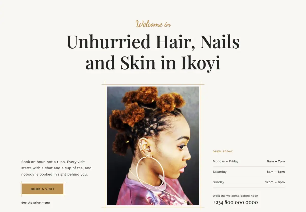
An elegant salon site in gold and charcoal, with script words over serif titles and a printed price menu.
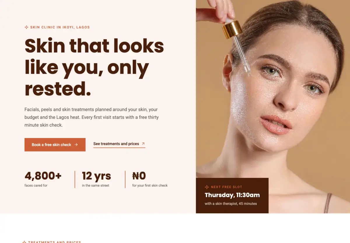
A warm skin clinic site in terracotta and blush, with a priced treatment menu and a free first skin check.
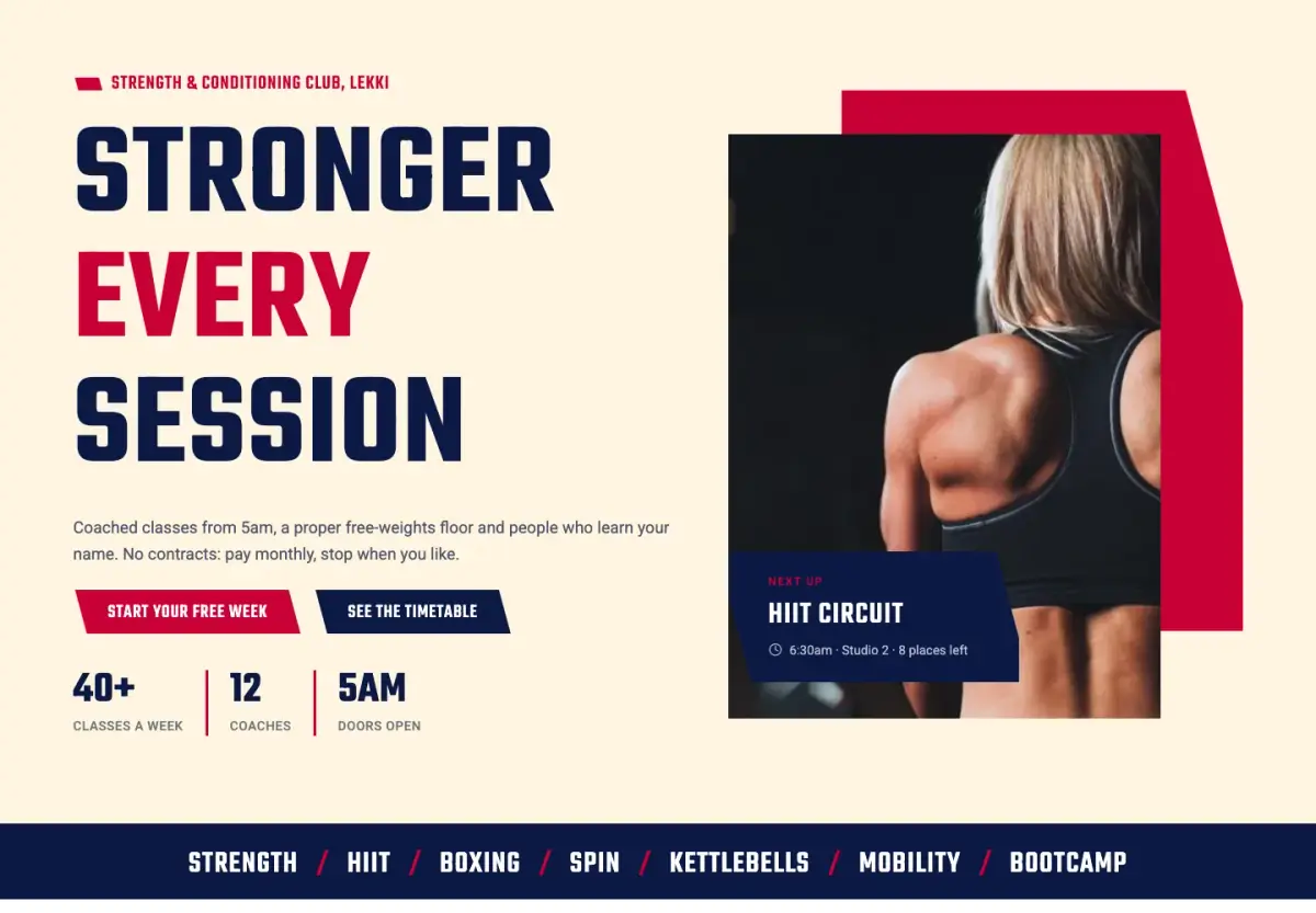
A punchy gym and training club site with tall condensed capitals, a class timetable and membership plans.
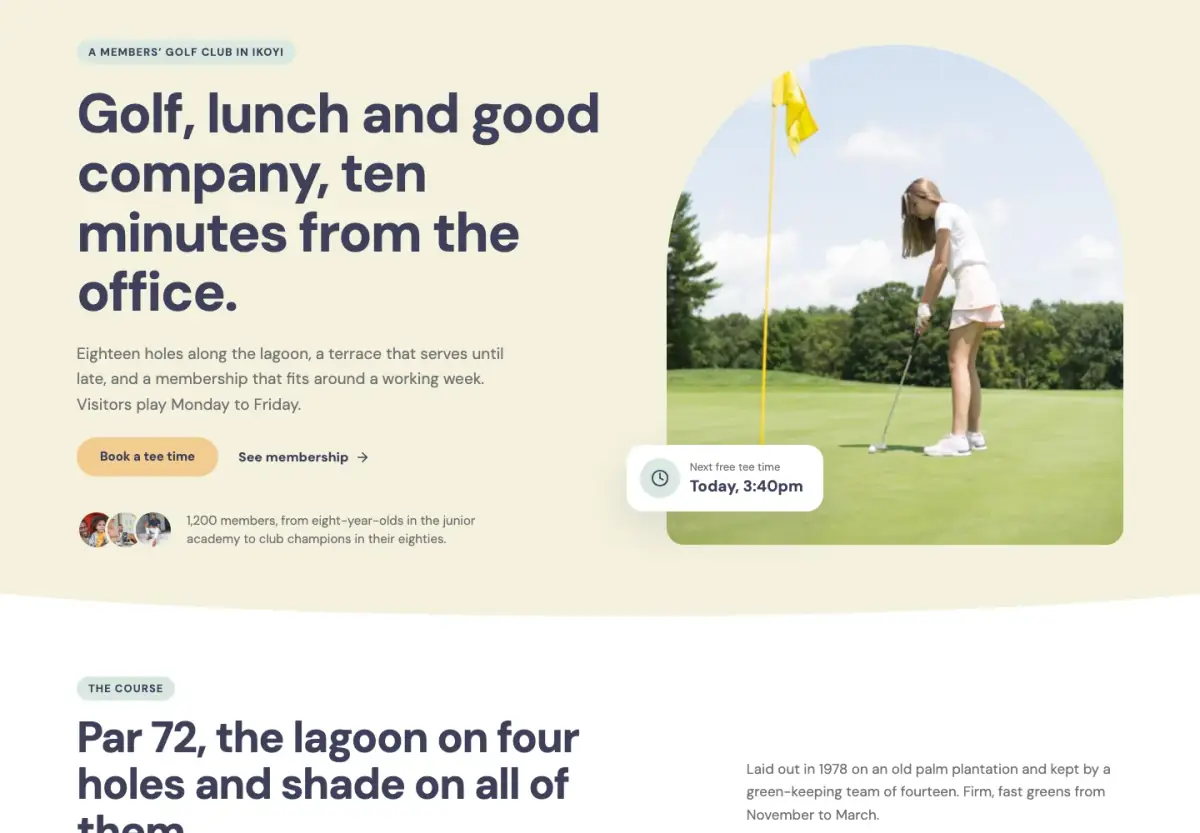
A calm, friendly site for a members' club, with tee times, membership, a scorecard and the club calendar.
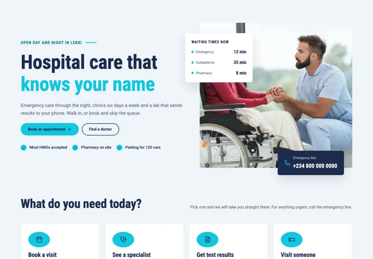
A reassuring hospital site with waiting times up front, departments, doctors on duty and priced health checks.
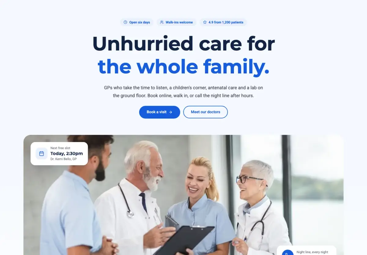
A calm, blue family clinic site with opening hours, clear prices and the doctors' days up front.
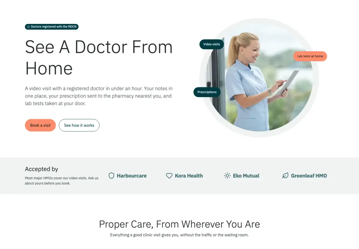
A calm, light clinic site for video visits, with thin large headings, coral buttons and deep teal bands.
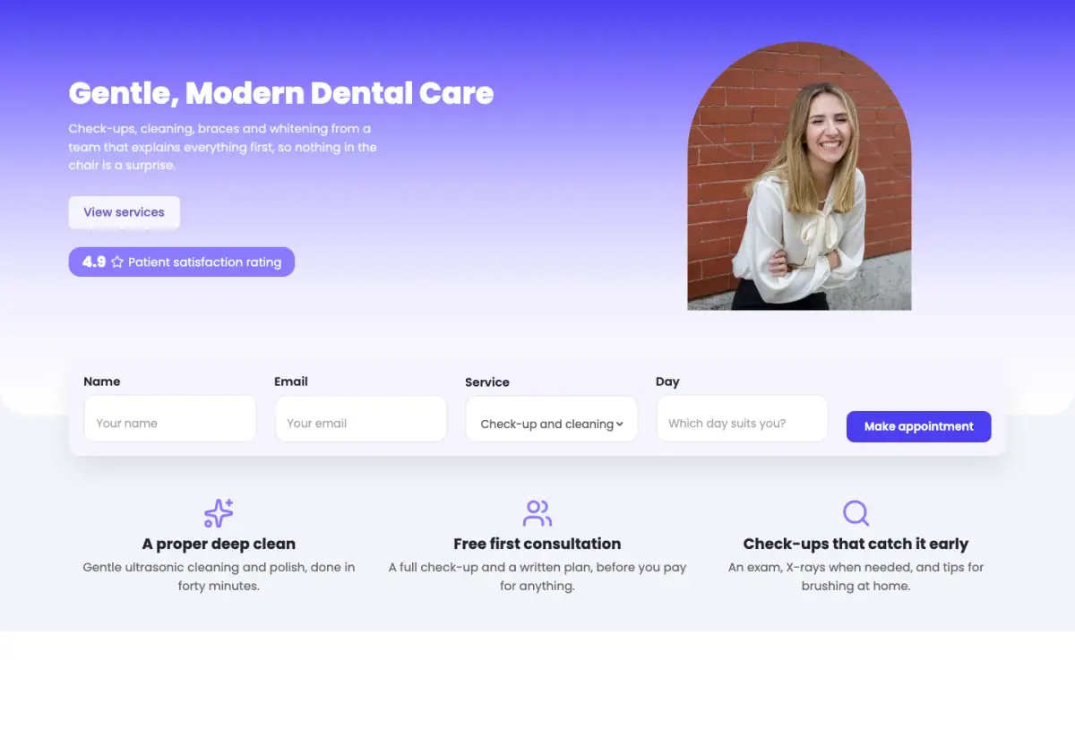
A bright dental clinic site with a gradient hero, an arched photo, a booking bar and a pricing page.
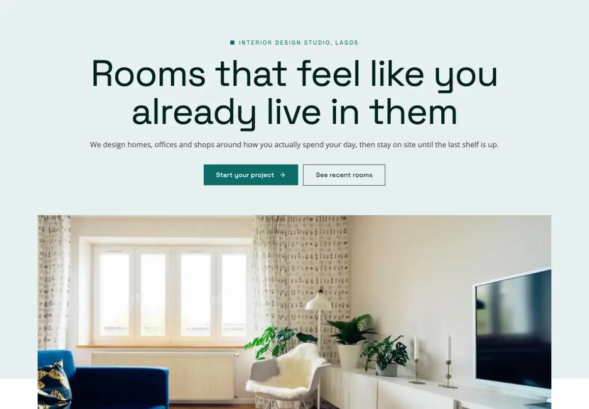
A calm, square-cornered studio site in deep teal and mint, with a service list, a clear process and rooms shown large.
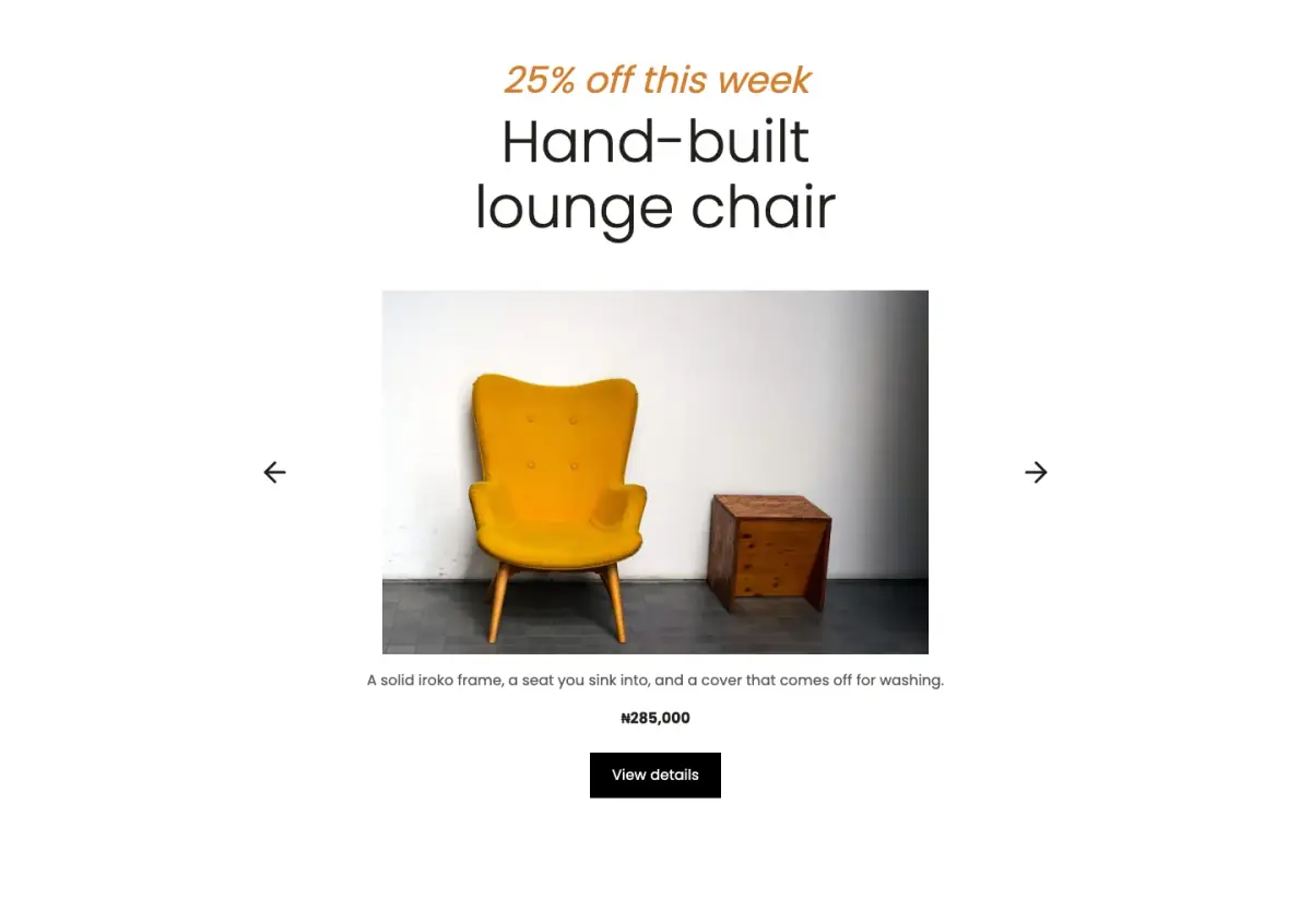
A calm, minimal furniture shop site with big light headlines, products on soft grey and a reviews page.
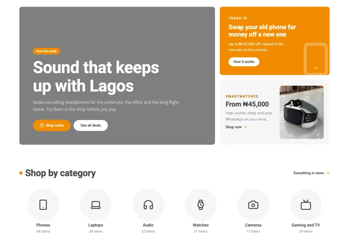
A bright, busy gadget shop site with bold orange deals, round category tiles and product cards made for browsing.
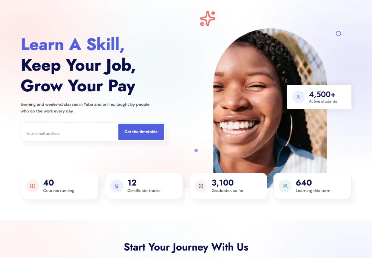
A bright school or course site with pastel washes, floating cards and course cards with fees.
A colourful college or training centre site with subject tiles, course cards with fees and a contact strip.
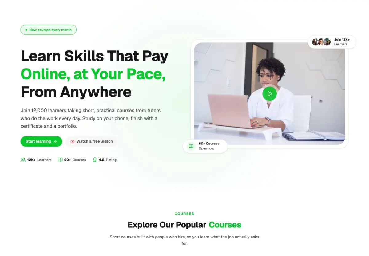
A friendly online school with green highlights, rounded course cards, tutor profiles, reviews and simple prices.
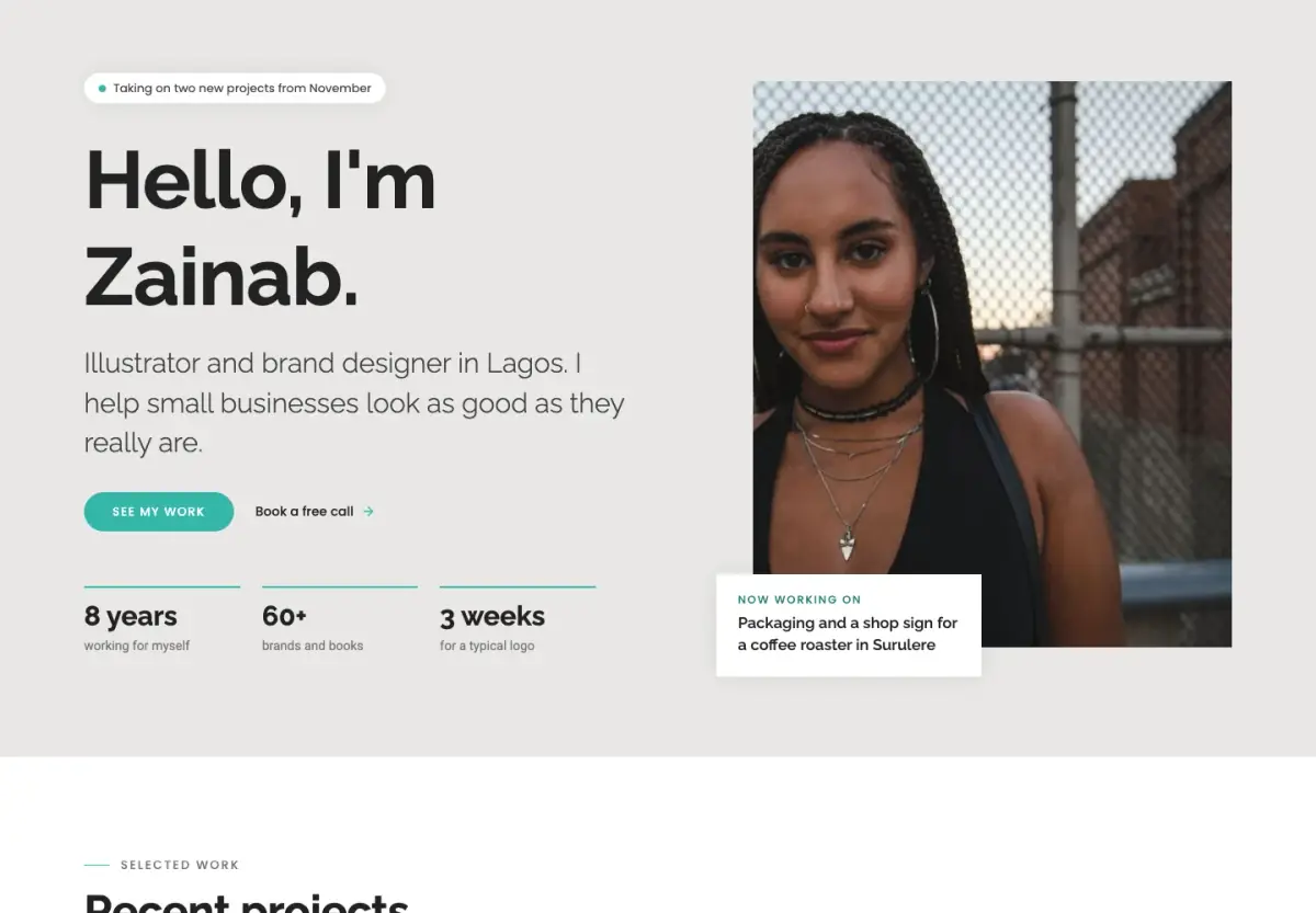
A quiet personal site for a freelancer or consultant: your work, your services and prices, your story and a contact page.
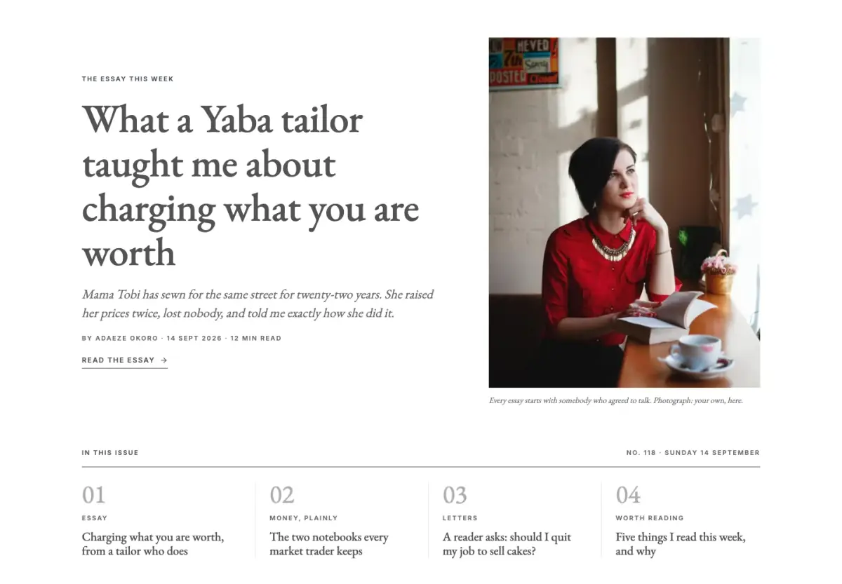
A quiet, bookish site for a writer or small publication, with serif essays, dated story lists and a weekly letter signup.
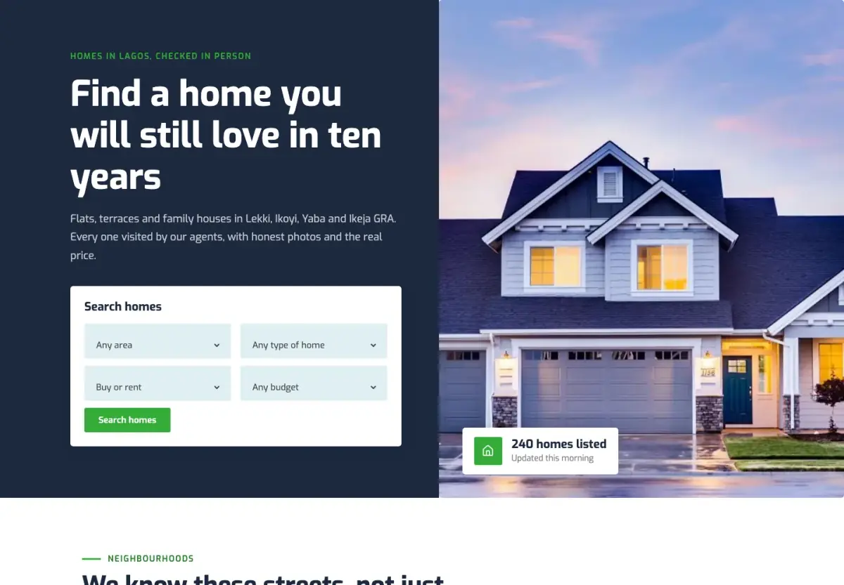
A fresh green and navy estate agent site with a home search up front, neighbourhoods, agents and a free valuation.
A dark AI product site with a glowing hero, a dashboard drawn in the page, gradient buttons and a pricing page.
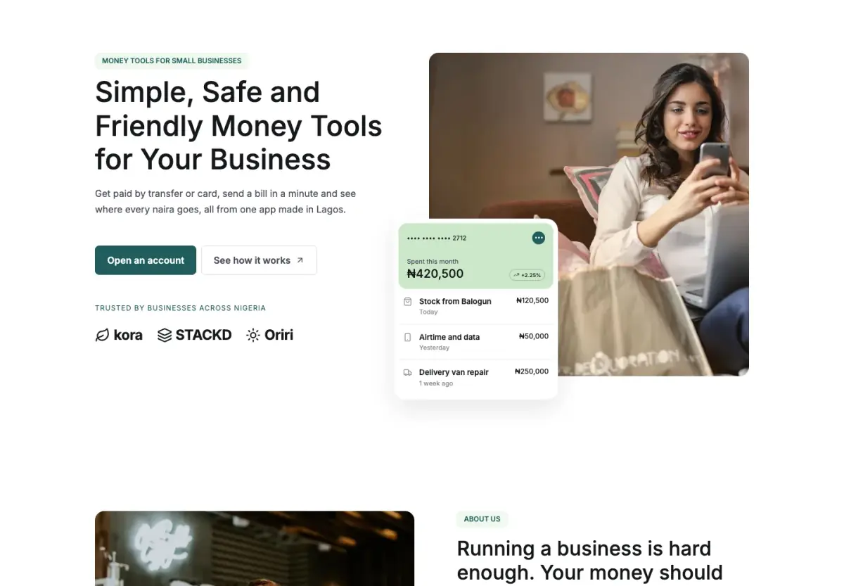
A calm site for a money or finance app in teal and mint, with an app card in the hero and clear prices.
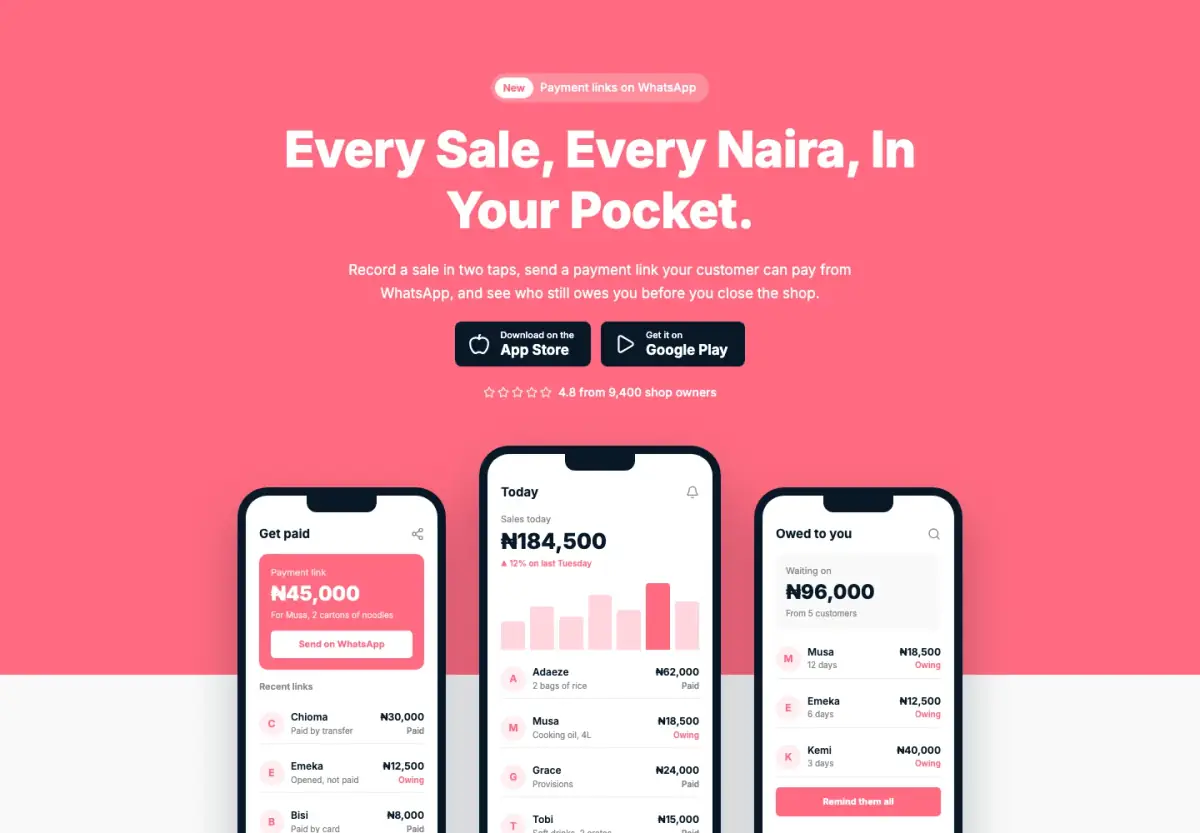
A bright, friendly site for a mobile app, with phone screens, simple steps, reviews, prices and a download panel.
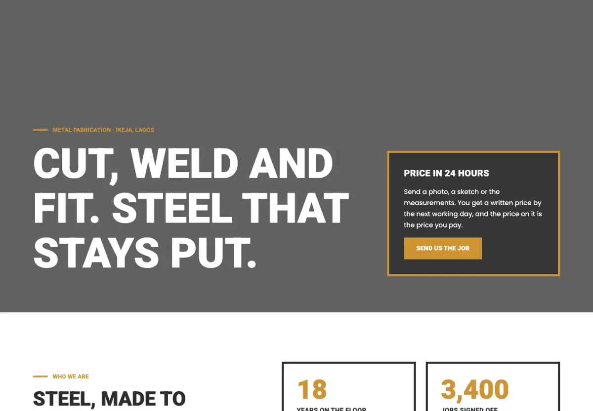
A heavy, industrial site for trades and workshops, with capital headings, amber outlines and dark photo bands.
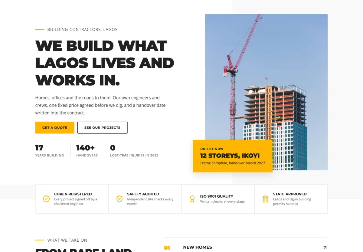
A clear, confident site for a building contractor, with site photos, numbered services, projects and a quote form.
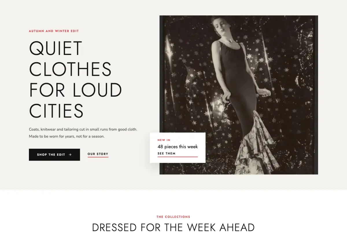
An editorial clothing store with big fashion photographs, thin capitals, one red accent, and a shop, bag and checkout.
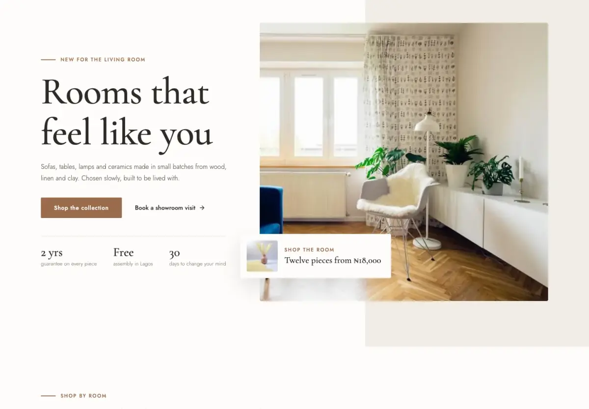
A calm home and living store with soft neutrals, serif headings, rooms shown large, and a basket and checkout.
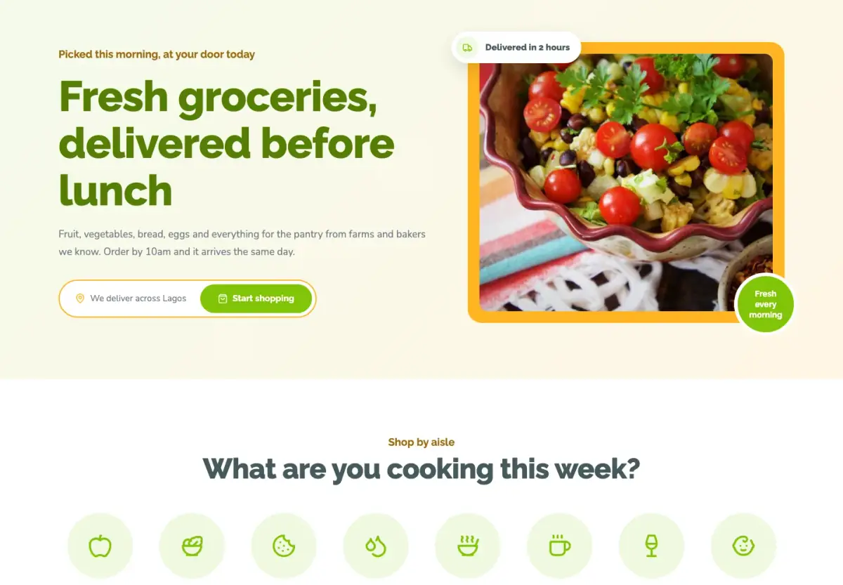
A fresh, friendly grocery store in green and yellow, with round aisle tiles, rounded cards and a basket and checkout.
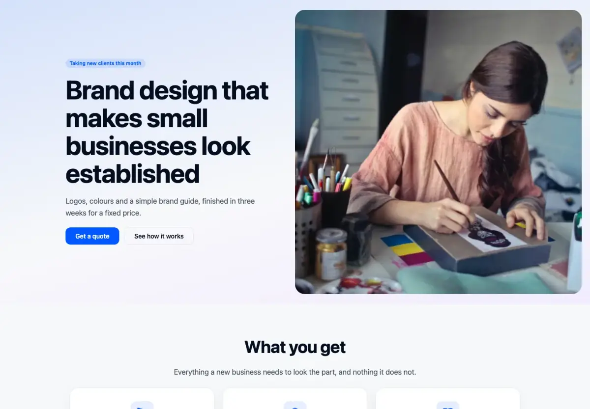
One page to sell one service: a photo-led hero, what they get, how it works, proof, prices and a closing form.
A launch page with a big centred headline, three benefits, proof, one offer and the questions people ask.
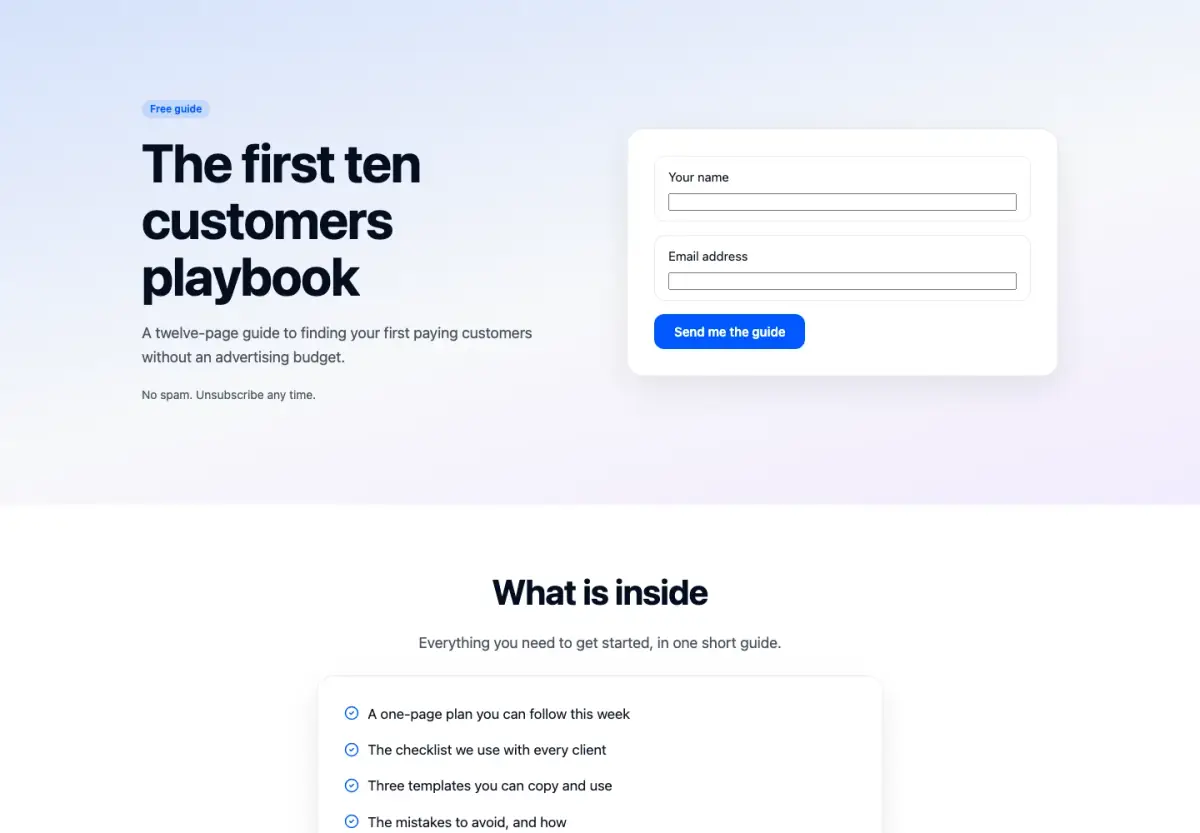
Give away a guide for an email address: the offer and the form above the fold, then what is inside and who wrote it.
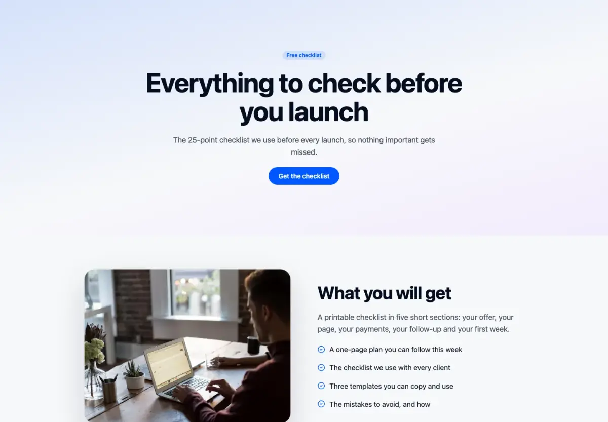
A short page for a free checklist or template: a centred promise, a picture of what is inside and one short form.
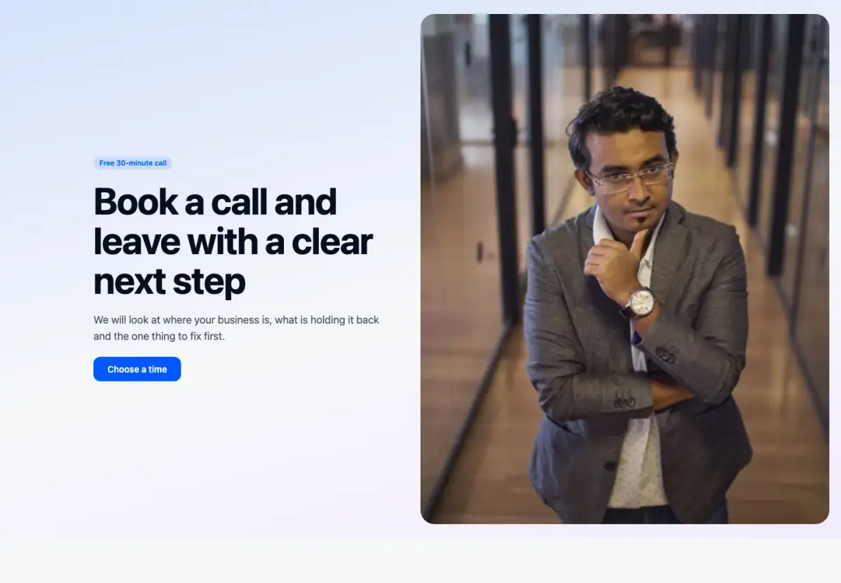
A page that books consultations: a split hero, what the session covers, your bookable services and questions.
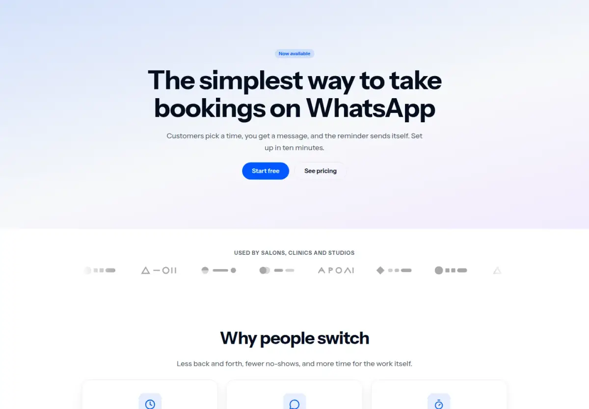
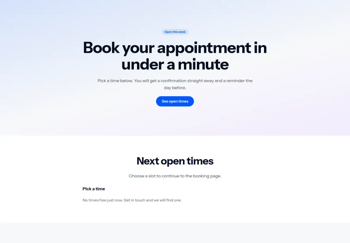
A booking page that goes straight to your next open times, then explains how it works.
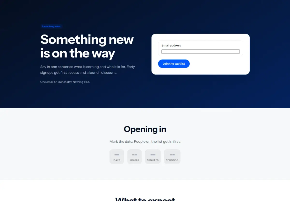
A waitlist page with a bold promise, a clock counting down to launch day and one signup form.
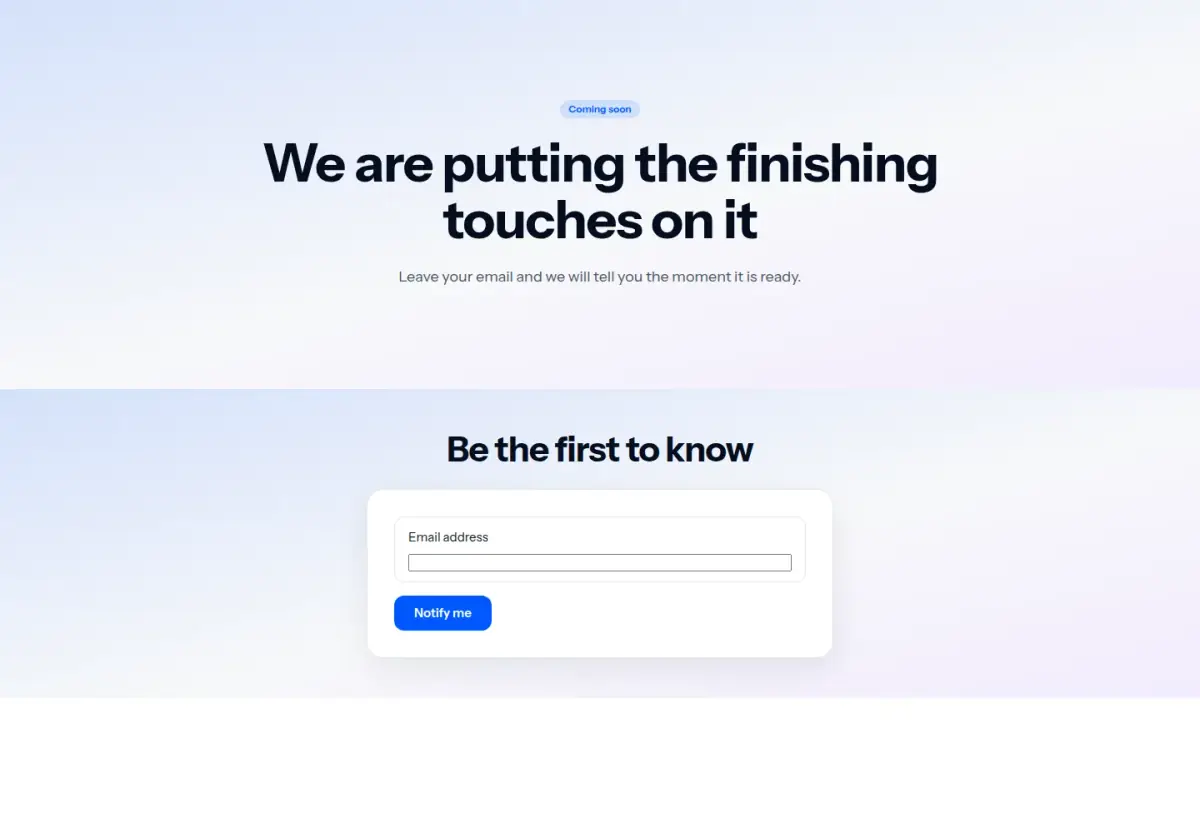
A one-screen coming soon page: the name, one line, a signup form and nothing else.
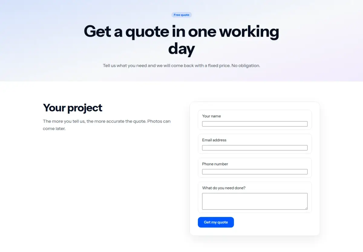
A quote request page: words on the left, the quote form on the right, then how it works.
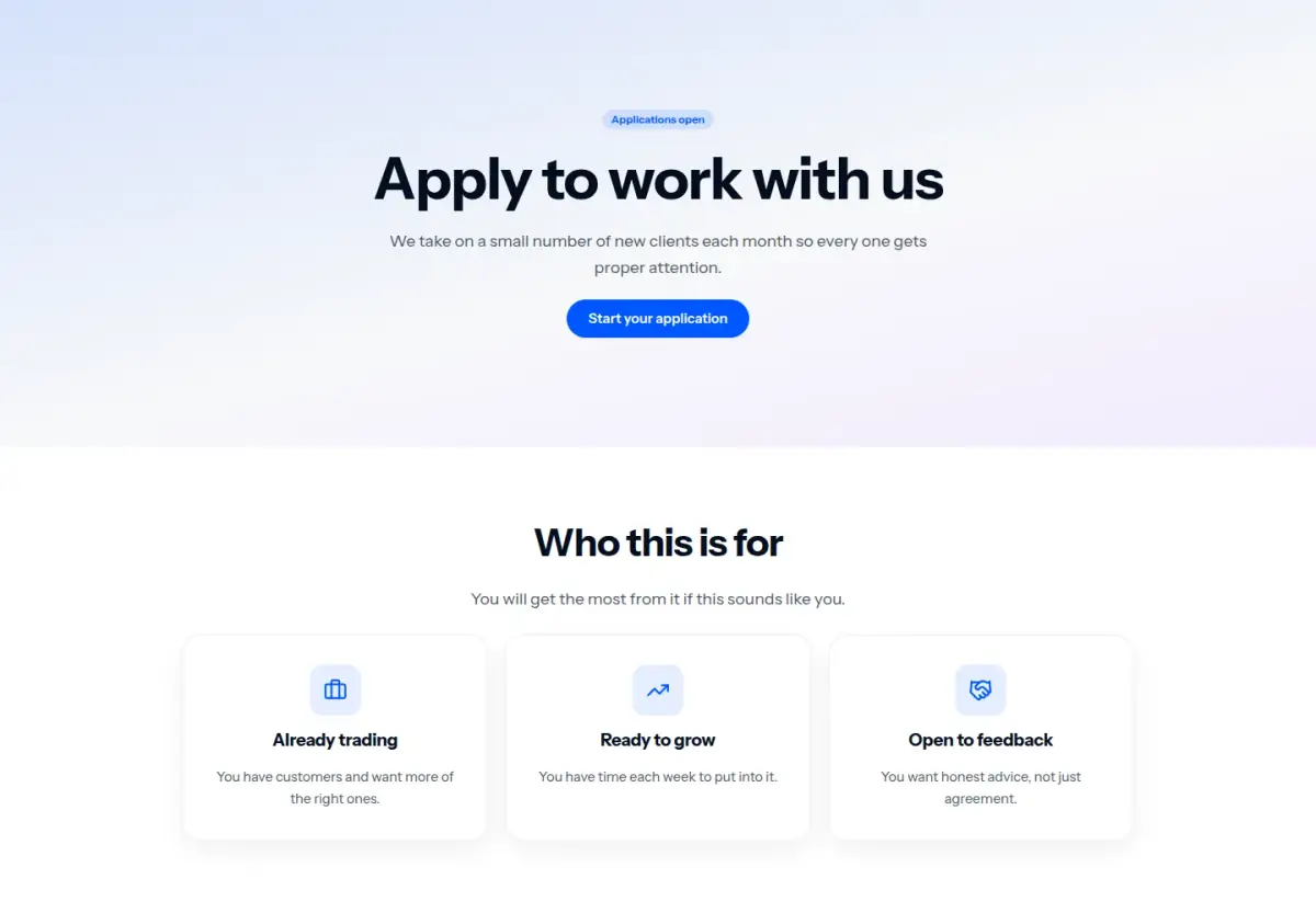
An application page: who it is for, what they get, then a longer application form.
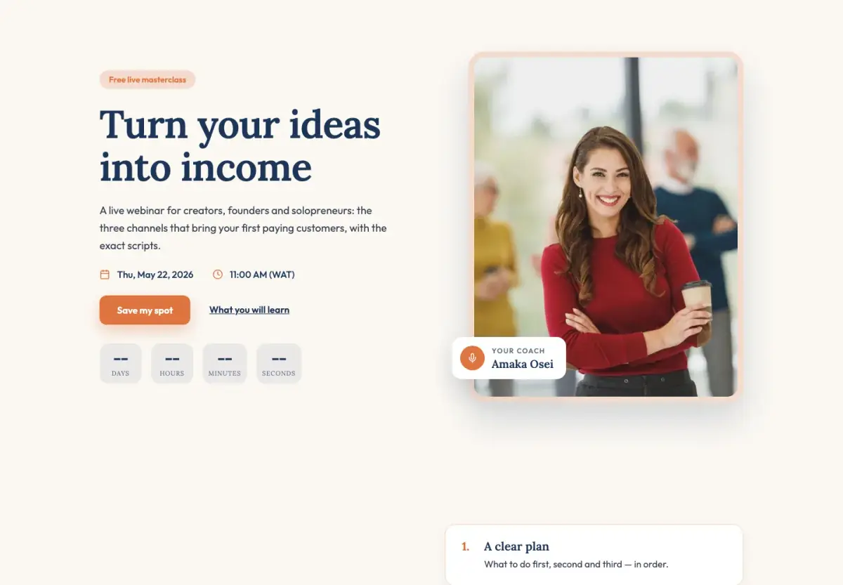
A masterclass registration page for coaches and consultants: your portrait, why to join, your story and a warm sign-up.
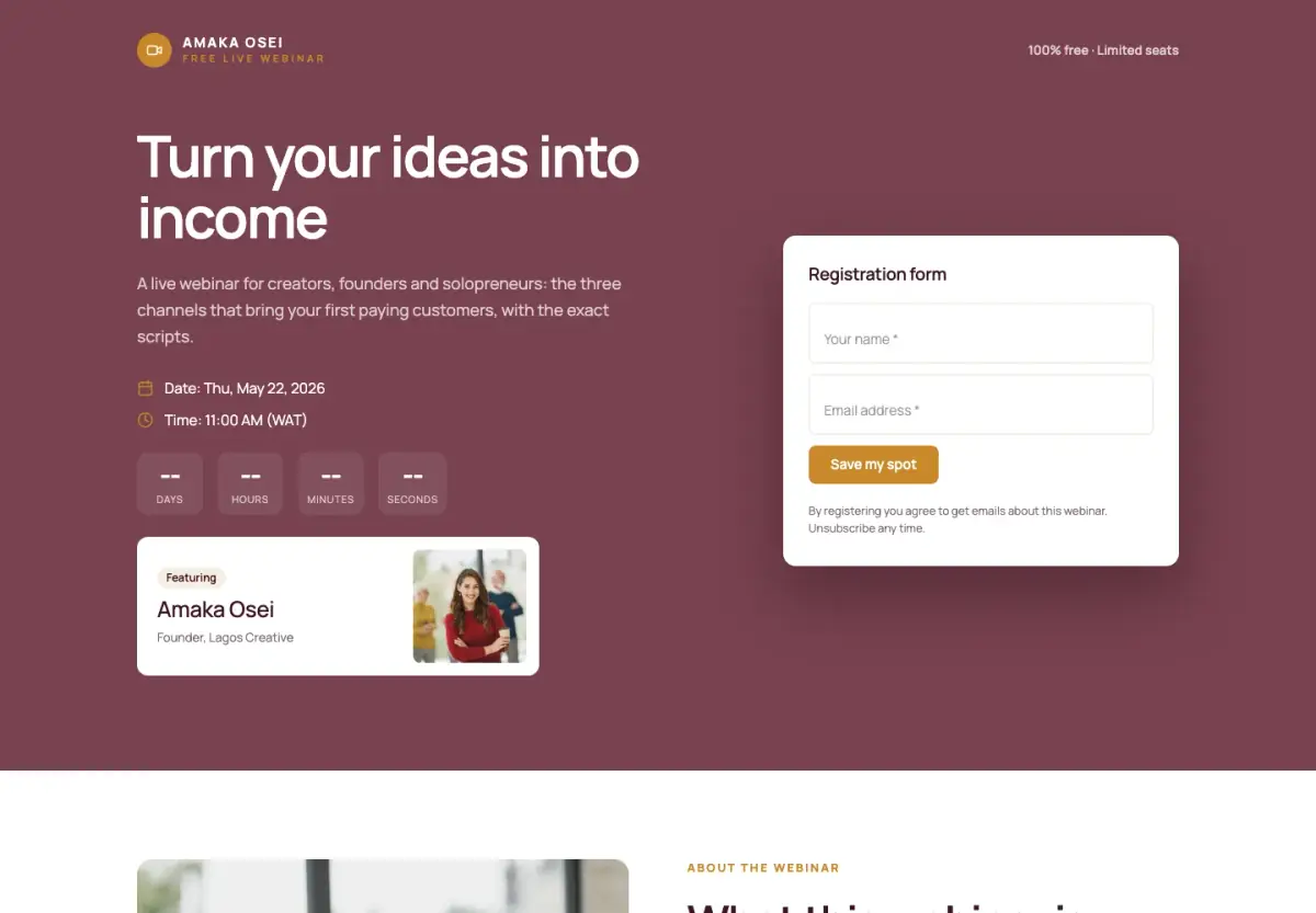
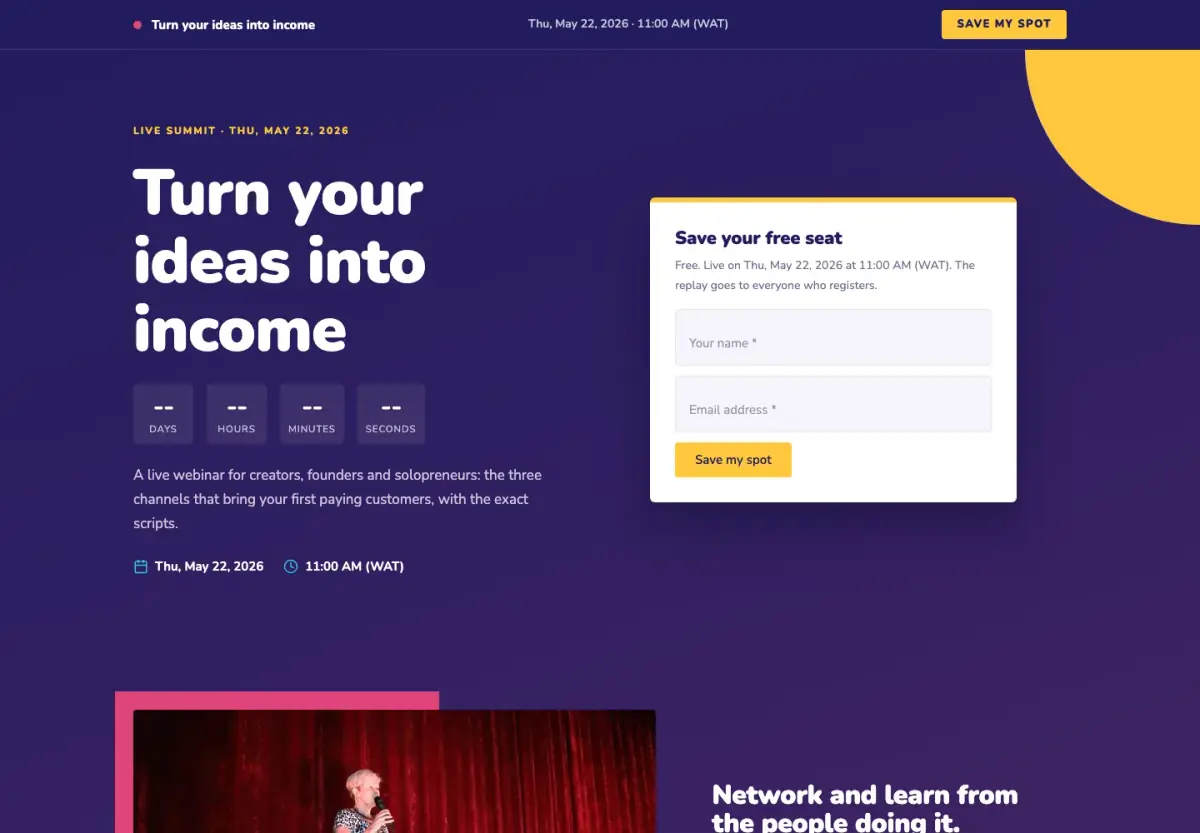
A webinar page built to get sign-ups: a deep, warm hero with the form right beside the headline.
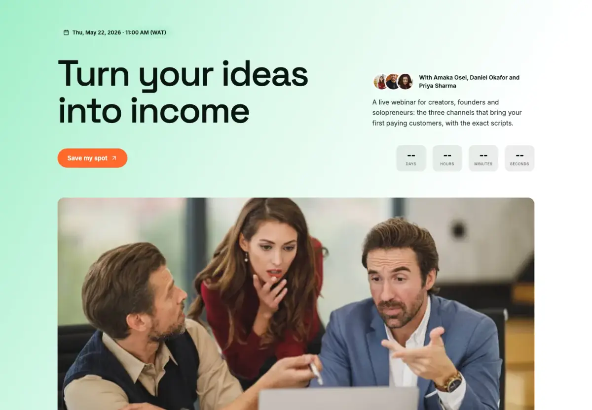
A workshop page for several speakers: a fresh green hero, speaker cards, the agenda and a dark sign-up band.
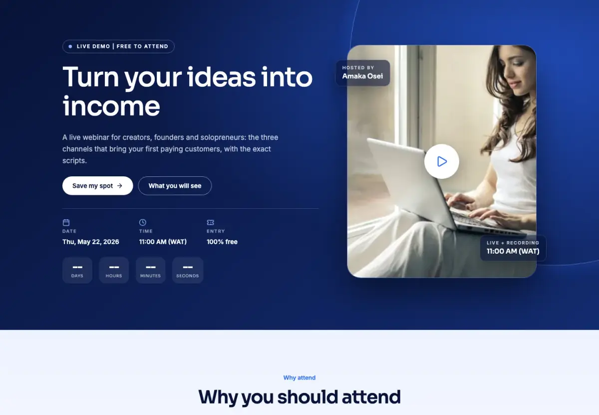
A product demo page with the demo front and centre on a deep-blue hero, then what people will see.
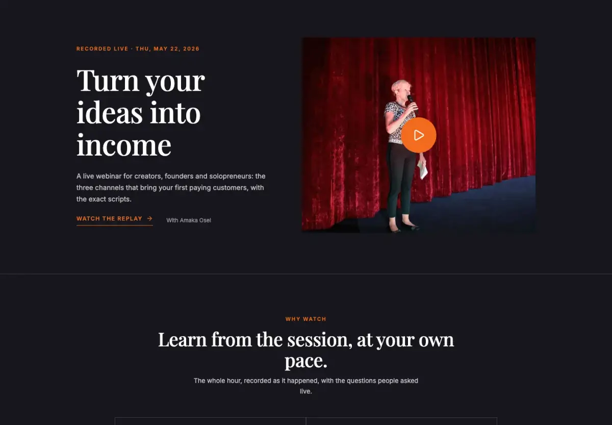
A dark, cinematic replay page that puts the recording first and keeps people signing up after the event.
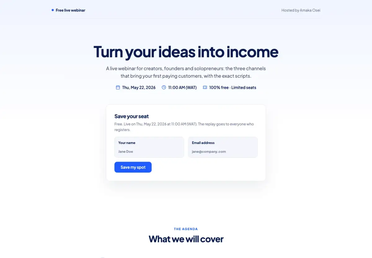
A clean, minimal webinar sign-up page: the title, the date and the form on one screen.
A big-event page: a register bar that follows you down, the clock and the form above the fold, and every speaker.
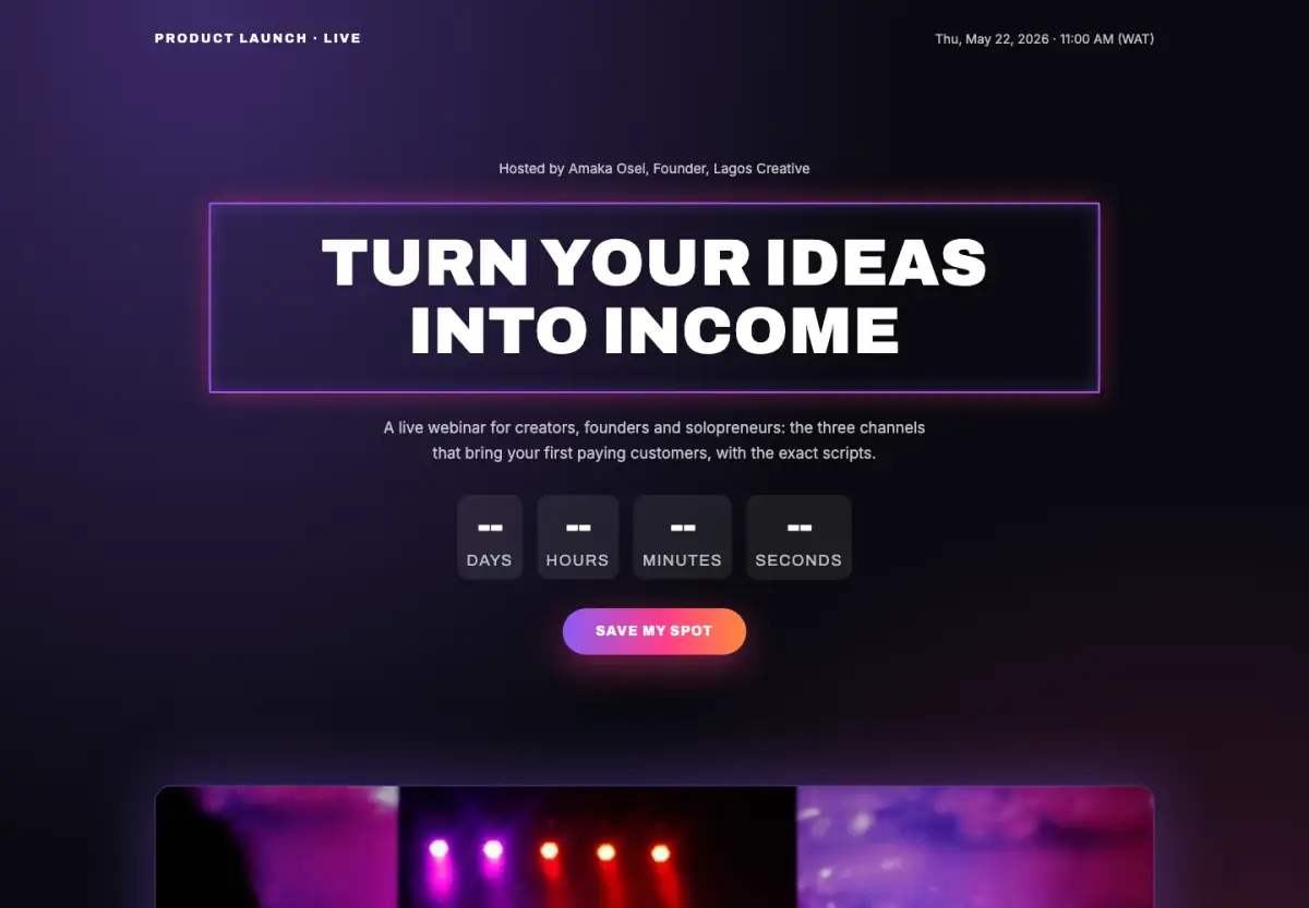
A launch-day reveal on black: a giant countdown, what is new, and a seat for the first look.
A free menu page for a restaurant or café: dishes and prices, a WhatsApp order button, table bookings, hours and location.
A catering menu page with packages, minimum orders and a quote request for events.
One mobile page for your links, a video, products, bookings and an email signup, in one of 12 themes.
Each type has its own page with more detail on what it is for.
Describe your business in a sentence. Chip picks a design, writes the words in your brand and fills in the rows. You see the price in credits first, and nothing goes live until you publish.
Most free website builders give you a nice page and stop there. With startbuddi, the page is wired into the rest of your business from the start.
No code, no designer, no plugin to install.
Straight answers, so nothing surprises you after you sign up.
See every planYes. Starting from any template is free on every plan, including the Free plan, and Publish sets no plan limit on how many pages you make. On the Free plan your pages carry a small "Powered by startbuddi" line; a paid plan can take it off.
It is a no-code builder for websites, landing pages, webinars, menus and a link in bio, with a Free plan. You can build and publish on the Free plan; paid plans add things like removing the startbuddi line and more Chip credits.
No. It is a no code website builder: you click to change the words, swap the photos and move sections around. Your brand colours and fonts are painted on every template for you.
Yes. Every picture on this page is a screenshot of the template in startbuddi. The words and photos in them are samples, and you replace them with your own.
Yes. Connect a domain you already own with one CNAME record and choose which pages it shows. You can't buy a domain inside startbuddi, and the link in bio page can't use a custom domain yet.
They become a contact in startbuddi, with the page they came from, so you can reply, book them in or send them a quote from the same place.
Yes. Describe your business in a sentence and Chip writes the first draft in your brand. It uses credits: the Free plan has 100 a month, and a landing page costs 15.
Pick a template, change the words, publish. Every enquiry lands in your contacts, ready for follow-up.