Three people visited your services page today. All three left without sending a message. Not because your offer is wrong. Not because your price is too high. Because…
- What Does a High-Converting Services Page Layout Actually Look Like?
- How to Structure Your Service Page for Maximum Clarity
- Why Pricing Transparency Stops Visitors from Quietly Leaving
- The Trust Signals That Turn a Visitor Into a Booked Inquiry
- How to Turn a Single Inquiry Into an Automated Client Journey
Three people visited your services page today. All three left without sending a message. Not because your offer is wrong. Not because your price is too high. Because your page made them work too hard to say yes.
A services page layout is not just a design choice. It is the difference between a visitor who thinks “this looks interesting” and one who actually clicks the inquiry button. When the structure is right, people feel understood, trust you faster, and act. When it is off, they scroll, hesitate, and close the tab.
This guide will walk you through how to build a service page that converts, what real service page examples get right that most small businesses miss, and how to connect your page to a back end that handles every inquiry without you lifting a finger.
What Does a High-Converting Services Page Layout Actually Look Like?
Most service pages are built backwards. They open with “Welcome to our agency” or a list of what the business offers. But a visitor landing on your page is not thinking about you yet. They are thinking about their own problem.
A converting services page layout starts with that problem. It speaks directly to the customer pain points your target client is already feeling before they found you. It then walks them through a clear journey: here is the problem, here is the solution, here is the proof, here is the price, here is what to do next.
Every section earns the next scroll. That is user journey optimization in practice.
How to Structure Your Service Page for Maximum Clarity
Think of your page as a conversation, not a brochure. Here is the structure that consistently works:
- A headline that names the pain point Skip “Our Services.” Write something your ideal client would nod at immediately. A business coach might open with: “You know exactly what you want for your business. You just need the right structure to get there.”
- A short problem statement Two or three sentences that describe the situation your client is in right now. Be specific. The more it sounds like their inner monologue, the more they lean in.
- Your solution and services Now introduce what you do, framed as the answer to their problem. List your services clearly in plain language. Add a short description to each one so visitors know exactly what they are getting.
- Proof This is where trust signals do their job. Testimonials, case studies, logos, results. According to Nielsen Norman Group, first impressions affect how users judge a website’s credibility and usability almost instantly. If your page does not communicate value right away, they are gone.
- Pricing: You do not need a full rate card. Even a starting price or a simple package range gives visitors enough confidence to stop second-guessing and reach out.
- A call to action placed at least three times After the headline, after your services, and at the bottom. Use specific language. “Book a Free Call” converts far better than “Contact Us.”
Why Pricing Transparency Stops Visitors from Quietly Leaving
This is the section most service businesses skip. And it costs them leads every single week.
Pricing transparency does not mean publishing a rigid rate card. It means giving visitors enough information to know whether they are in the right place. A starting price, a package range, even a sentence that says “Projects typically start from $500” removes the anxiety that quietly pushes people away.
When there is zero price information on a lead generation page, the default assumption is that it is too expensive. A visitor with no budget reference point will always assume the worst and move on to someone who was more upfront.
Real service page examples that convert well nearly always include some form of pricing. It signals confidence. It filters for the right clients. And it reduces the back and forth that wastes your time before a quote is even discussed.
The Trust Signals That Turn a Visitor Into a Booked Inquiry
Conversion rate optimization is not only about the layout. It is about the feeling a visitor gets as they move through your page. Trust signals create that feeling.
The most effective ones are:
- Testimonials placed close to your call to action, not buried at the bottom
- Case studies that show a before and after, even if it is just one short paragraph
- Logos of clients or recognizable brands you have worked with
- A professional photo of you or your team, because people buy from people
According to BrightLocal, more than 79 percent of consumers trust online reviews as much as a personal recommendation. The evidence is already on your side. You just need to place it in the right spots on the page.
How to Turn a Single Inquiry Into an Automated Client Journey
Here is where most small businesses lose what their service page worked hard to win.
A visitor fills in your contact form. That submission sits in an inbox. You see it three hours later. You reply manually. The meeting gets scheduled through a back and forth email chain. No reminder goes out. The client forgets. The call never happens.
This is a systems problem, not a motivation problem. Most founders focus entirely on getting conversions but have no system ready to handle what comes next.
When your form, CRM, booking tool, and notifications are all connected, the same inquiry looks completely different. The client fills in the form. A confirmation hits their inbox instantly. They click a link and book a call. A reminder goes out the morning before. You show up to a prepared meeting with all their details already in front of you.
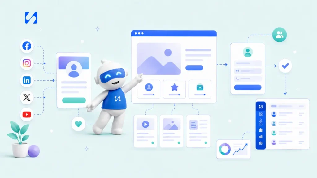
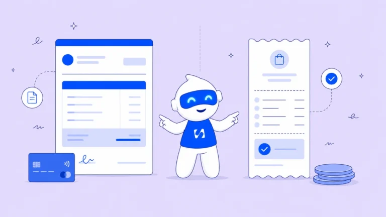
That kind of workflow is what platforms like Startbuddi are built for. Instead of paying separately for a form builder, a CRM, a booking tool, and an email platform, everything sits in one place. Where you would normally need Calendly for bookings, a separate CRM for client data, and Mailchimp for follow up emails, Startbuddi has all of it ready to go from day one. And unlike a standalone funnel that only captures leads, Startbuddi connects the full journey from first inquiry to confirmed booking to automated follow up. According to HubSpot, leads contacted within five minutes are nine times more likely to convert. That kind of speed is only possible when your back end is fully connected.
Frequently Asked Questions
How long should a services page be? Long enough to answer every question a serious buyer would have, short enough to stay focused. Most high-converting service pages land between 600 and 1,200 words depending on the complexity of the offer.
Where should the call to action go on a service page? At minimum, above the fold, after your services section, and at the very bottom. Visitors are ready to act at different points. Give them the option wherever they are reading.
Run this from one workspace
Clients, projects, money and marketing — connected, not scattered across five apps.
See how it worksDo I need case studies on my services page? They help significantly but they do not need to be long. Even a one paragraph before and after story from a real client adds credibility that generic testimonials simply cannot match.
What is the difference between a services page and a landing page? A landing page is built around one specific offer or campaign with a single call to action. A service page covers your full offer, builds broader trust, and may lead to multiple entry points such as bookings, forms, or quote requests.
Your Services Page Layout Is Your Best Sales Tool When It Is Set Up Right
A well-built services page layout does not just sit on your website looking nice. It works around the clock answering questions, building trust, and moving the right people toward an inquiry.
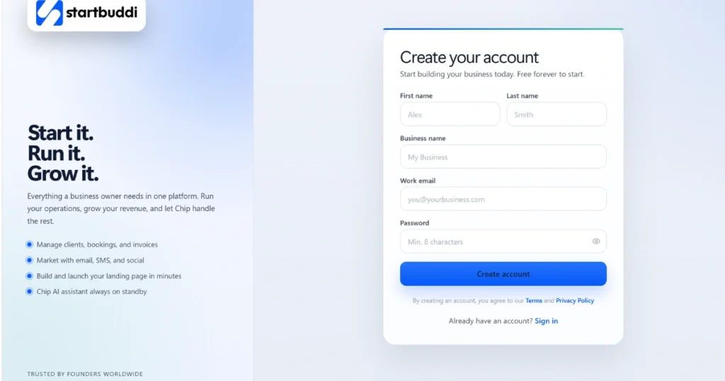
If you are ready to set up the systems behind it, Startbuddi lets you create a free account, pick only the modules you need, and get everything running in days. Paid plans start at less than ten dollars a month, which means a fully connected, professional lead management system is within reach at any stage of your business
Put this into practice
Everything in this guide is built into startbuddi — free to start.
Start freeWritten by
Chinonye Umezinne
SEO Copywriter| Email growth Specialist| I help businesses increase revenue with strategic SEO content & high-converting email funnels.
Keep reading
Related playbooks
Stop reading. Start doing.
Free to start. No card needed. Your full workspace is ready in five minutes.